scroll
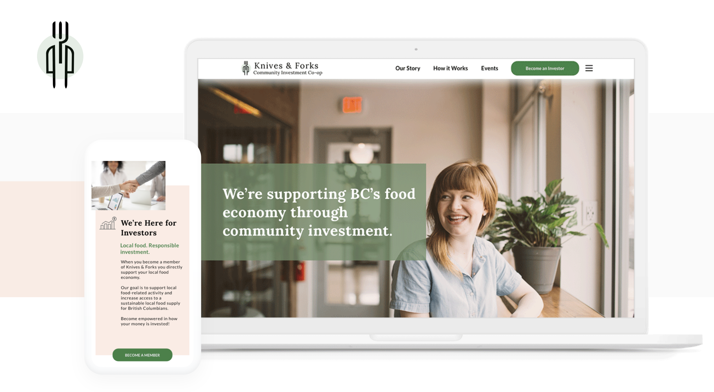
Knives & Forks, a community investment co-op that specializes in providing capital to support local food-related economic activity in BC, needed a new online presence that reflected its mission.To achieve this, they would like to solidify their visual design language and revamp the website.
In our initial client meeting, we were introduced to the history and values of Knives & Forks and how these elements connect to the current version of their website. During this discussion, we highlighted several areas within the existing design that need attention:
We began our research phase by exploring current investment platforms, with a focus on those connected to Canada and sustainability, along with organizations that support British Columbia’s local food economy.
While there are numerous crowdfunding and investment platforms, few cater to both aspects simultaneously. We examined three different groups focused on investment, food, and startups. This comparison provided us a clear outline of key elements to incorporate into the new website, such as a portfolio, company values, an application portal, and a team section. Additionally, the poor examples serve as valuable reminders of pitfalls to avoid.


We aimed to uncover the motivations and frustrations of our target audience by conducting interviews with individuals experienced in investment platforms and those who had applied for funding.

One interviewee’s comment perfectly encapsulated the core values of Knives & Forks:
"For larger investments, personal connections are key. Both the company and the investor need to know, trust, and share values with each other—not just focus on profit."
This sentiment, along with feedback from other interviews and surveys, highlighted key investor needs:
On the other side, entrepreneurs expressed their own set of concerns:
These insights underscored the importance of transparency, clarity, and personal connection in both investment and funding experiences. By digging deeper into these survey results, we identified what truly satisfies users when visiting an investment website, helping us tailor our approach to meet their needs effectively.
In the final phase of our research, I conducted an audit of the current website and gathered user feedback on its design. Key findings included:
As we transitioned into the next phase, we started by organizing our research findings into meaningful data clusters.This grouping process helped us gain deeper insights into our target users, particularly how they engage with investment co-ops like Knives & Forks. It also shed light on their concerns, frustrations, and preferences regarding a website’s visual style and content when it comes to investment and funding.
And based on the data synthesized from our affinity diagram, I created two sets of user persona and customer journey map for both entrepreneur and investor.
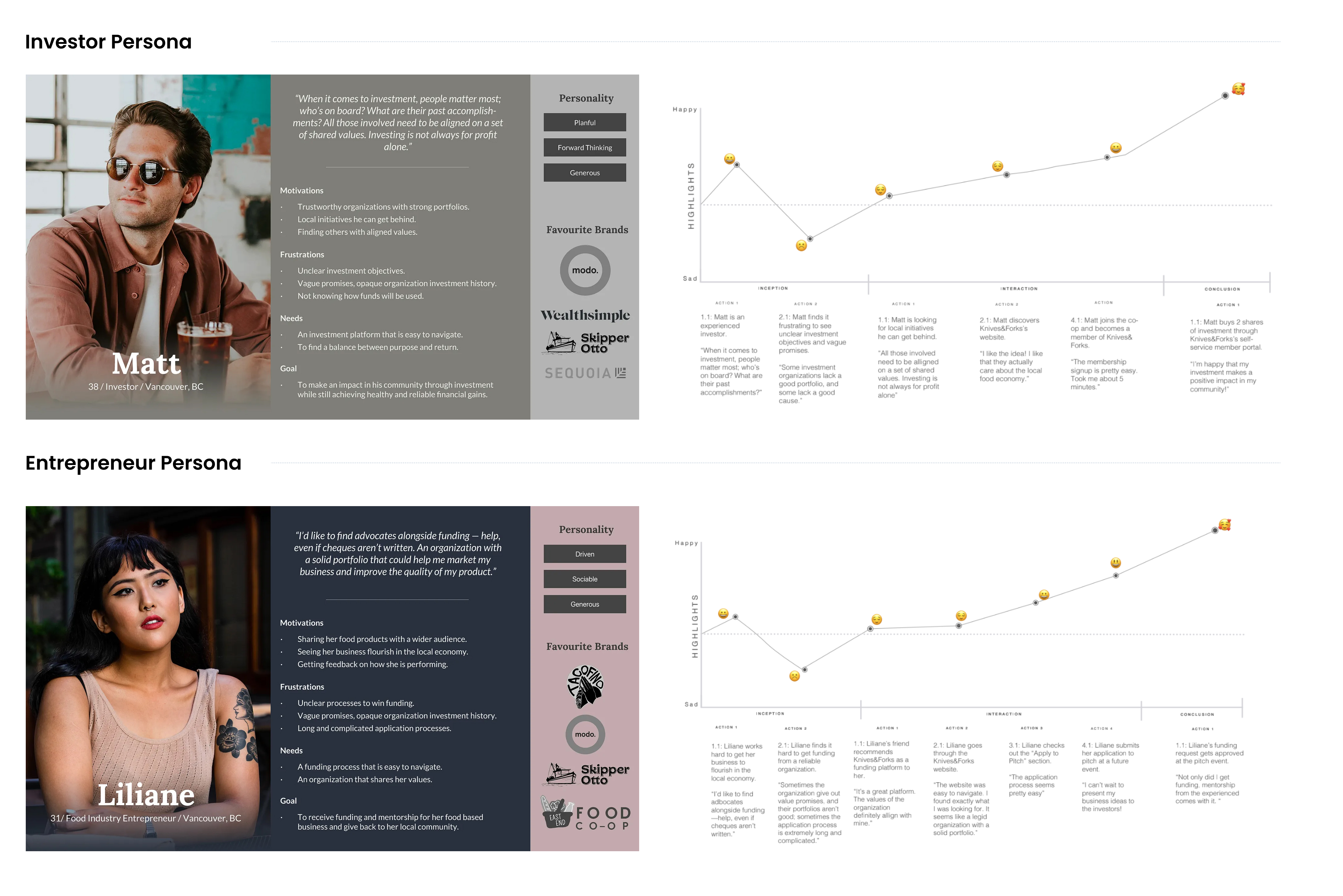
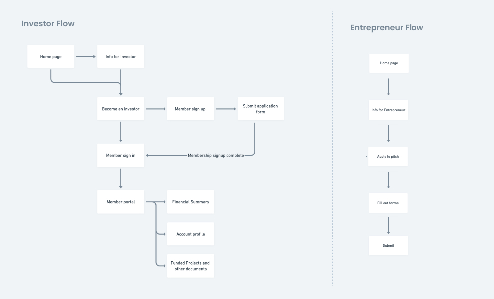
Based on the two types of personas and their corresponding journey map, we were able to create two user flows for investor-member and entrepreneur-applicant respectively.
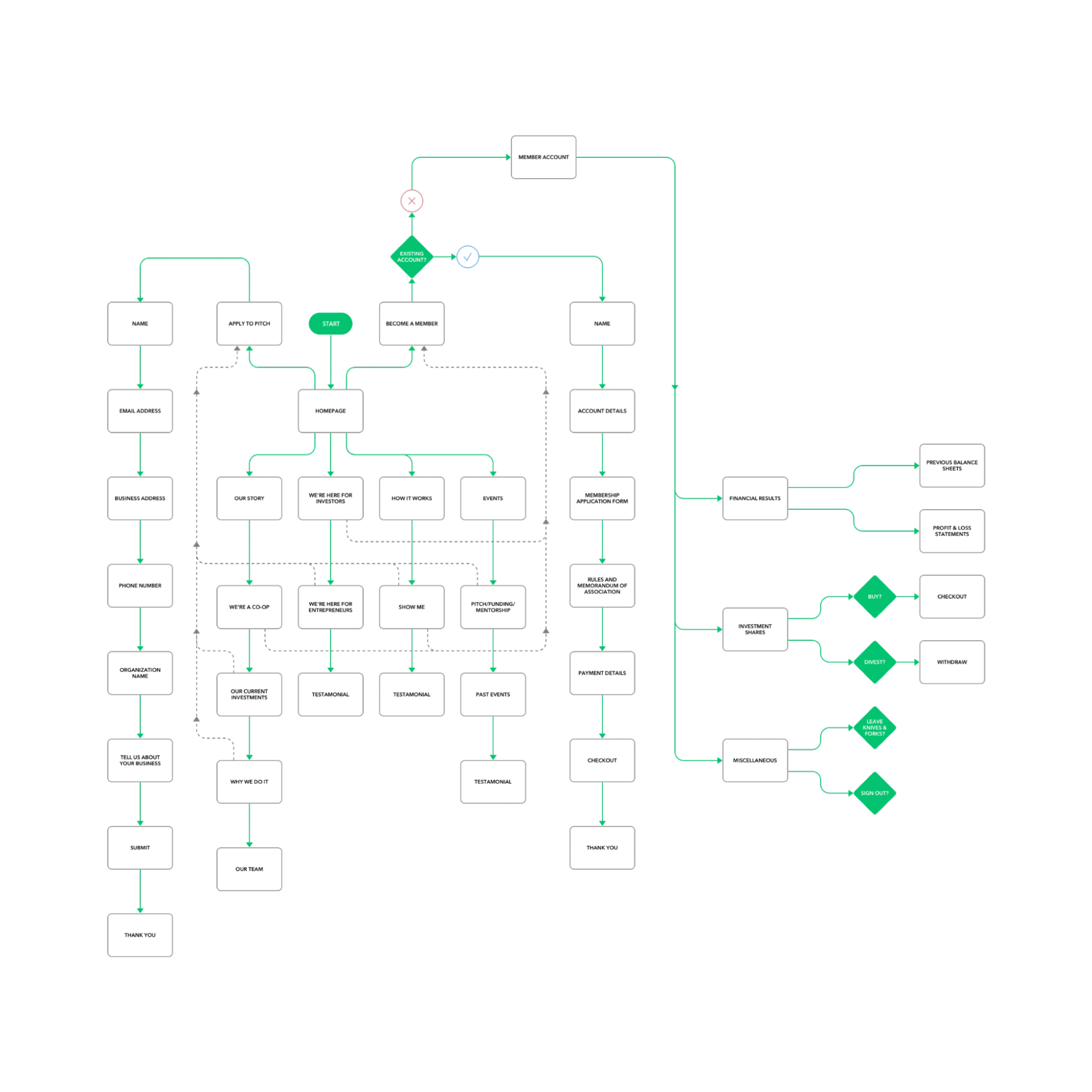
The final version of the sitemap went through three iterations during the planning phase. We revisited it during and after design and testing to ensure a smooth user flow, with no unnecessary or missing steps, allowing users to achieve their goals efficiently on the website.
Once our initial paper prototypes were complete, we moved on to testing. Participants were given two tasks:
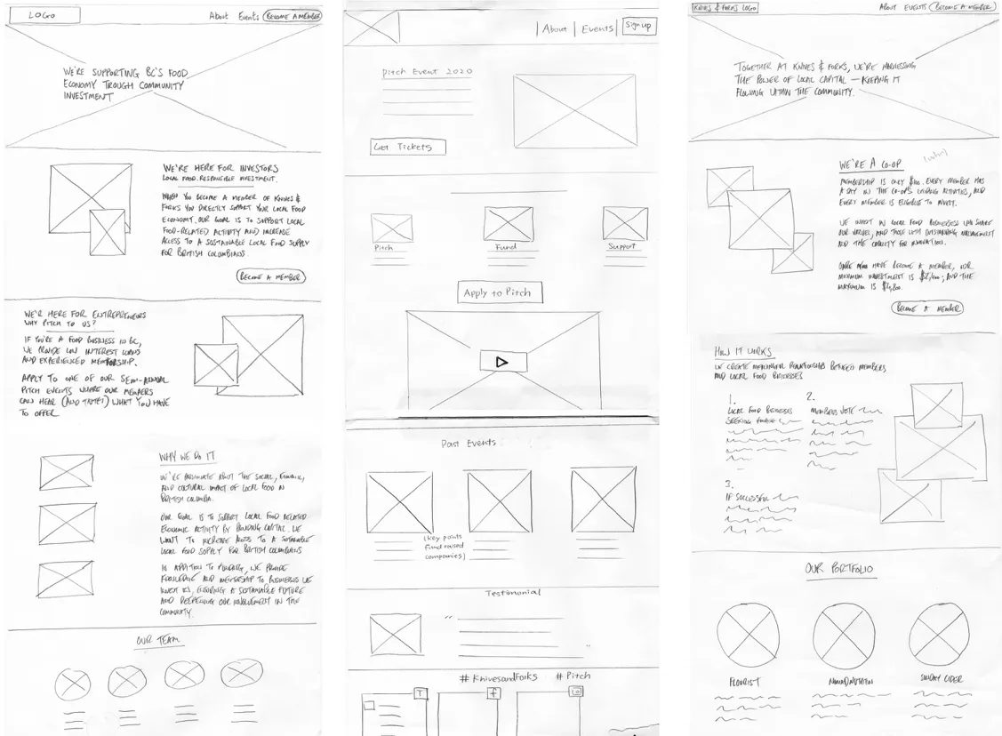
Since one of our main goals was to attract new member-investors, we focused on ensuring that users understood how the co-op works and could easily sign up. We also tested the “apply to pitch” process for entrepreneurs.
Testing revealed areas in the narrative flow that needed refinement, including modifications to the navigation bar. Clear navigation was a critical issue highlighted by our interviews and surveys, so addressing this early was essential.
We also incorporated inspiration from websites such as Skipper Otto and Wealthsimple which had come up in our research for having enjoyable structure and design… and along with these desktop prototypes, we began considering how the mobile version of our design would look as well.
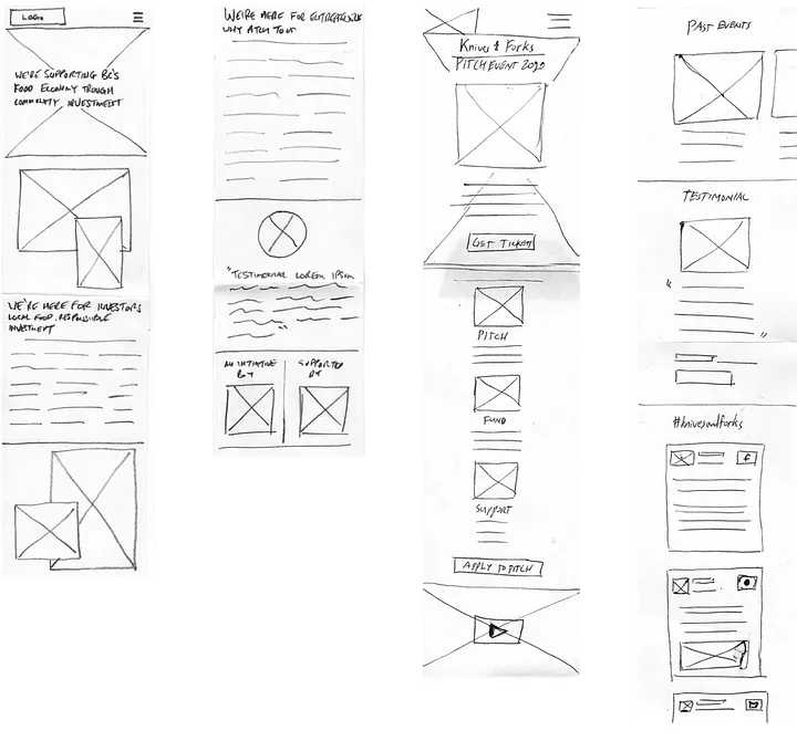
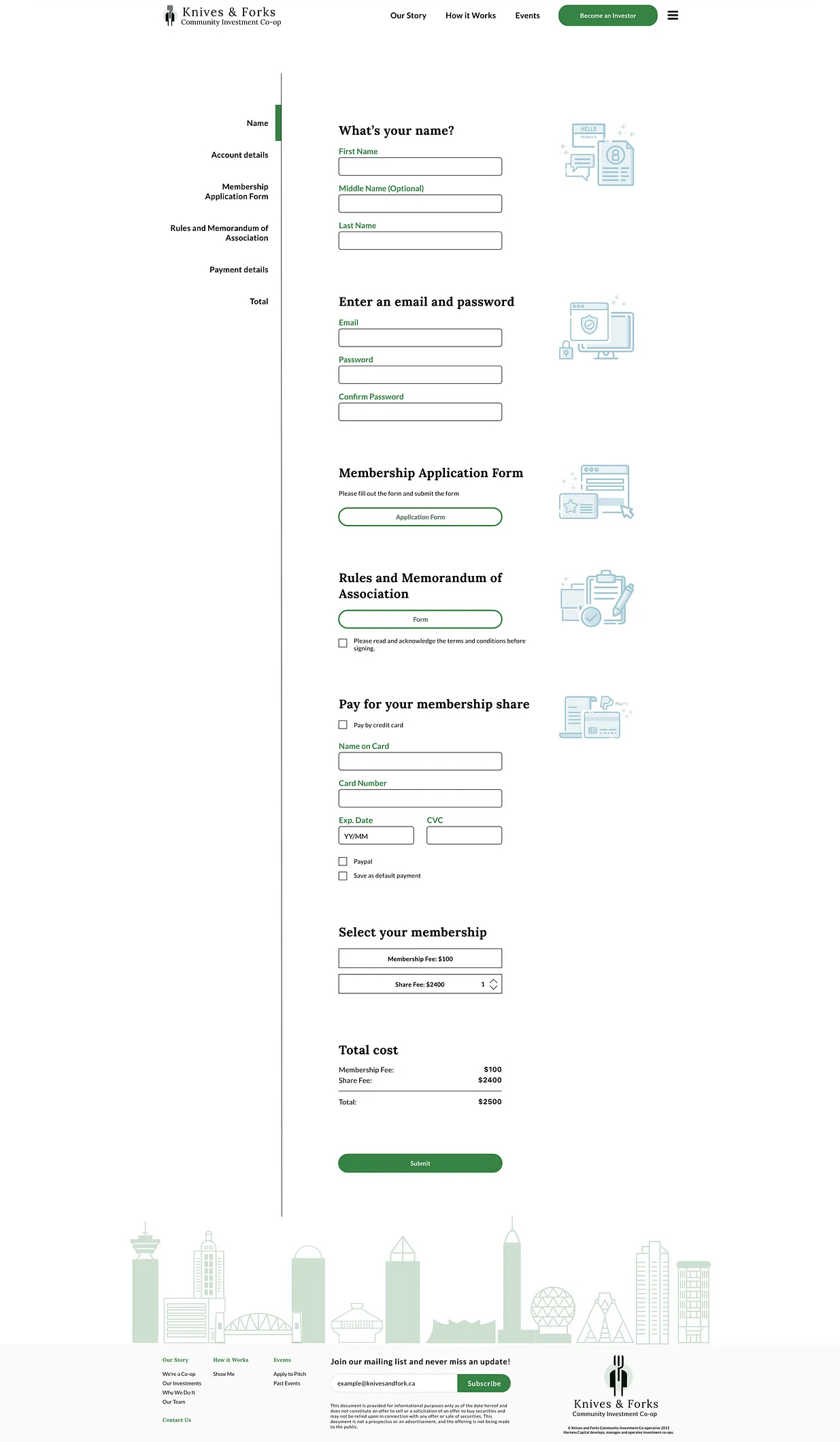
While our long-scroll pages adapted relatively well from desktop to mobile, the member sign-up form and the entrepreneur’s “apply to pitch” form required distinct approaches for each screen size.
On desktop, these forms were designed as long-scroll pages with a floating sidebar, inspired by BMO’s online sign-up process for style and usability. In contrast, for mobile, we found that a pagination style for both forms was more effective, a solution discovered through ongoing user testing.

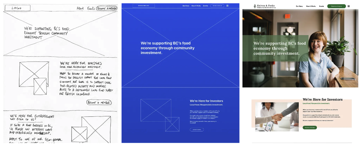
Originally, our landing page contained sections such as Our Story, How It Works, Portfolio, and Team all on one long scrolling page. Based on feedback, we restructured the content into more digestible chunks spread across different pages. This change also led to an update in our navigation bar from: “Home, About, Events” to “Home, Our Story, How It Works, Events”.
These adjustments are reflected in our mid-fidelity prototypes and beyond. Additionally, we renamed the “sign-in” button to “Become an Investor” to clearly differentiate between the entrepreneur and investor flows.
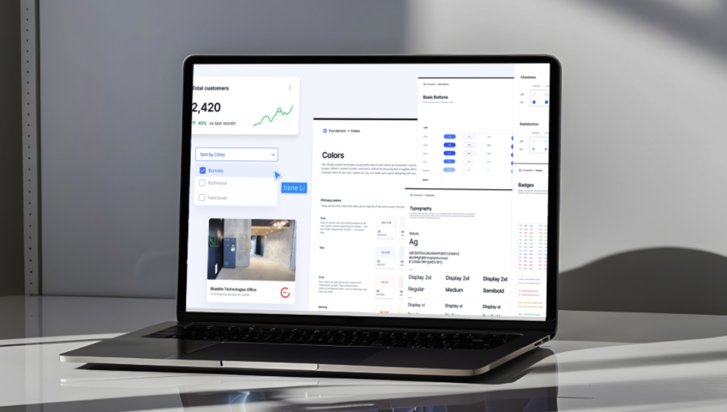
To quickly define the visual design direction, I did a fun exercise called Gut Test (presenting 20 screenshots visual designs to the clients and ask them to rate the designs on a scale of 1 to 5), aiming to determine the clients’ aesthetic preference in terms of website for the team to uncover an initial visual design direction.
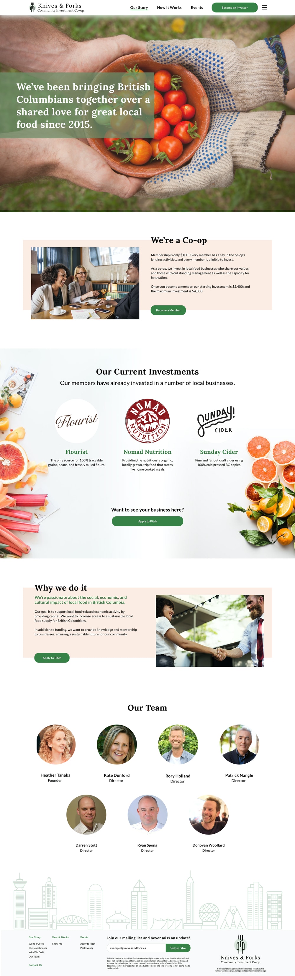
One of the defining elements of the website’s design is the imagery of assets with a vibrant, welcoming aesthetic. We aim to keep the visual design both impactful and memorable, creating an up-lifting browsing experience that doesn’t scream for attention nor overwhelm website users with needless distractions.


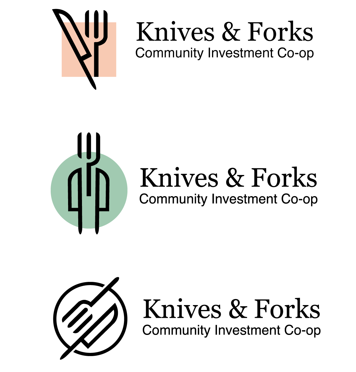
In addition to the website redesign, I redesgined the logo as well. The face of any company is its logo, and creating a bespoke design for Knives & Forks was a key initiative to represent the brand fully and authentically. Several logo concepts were meticulously crafted, each reflecting a powerful motif aligned with the organization's identity and rich in symbolic meaning.
The final logo, which was chosen for its ability to capture the company's ethos, combined two concepts: an abstract set of knife and fork that also depicted a man in a suit. As the client remarked, "We are investing in people, after all." This new logo, rendered in a simplified linear style, is not only easily recognizable across various platforms but also conveys a sense of professionalism.

Scrolled this far, you must really like me. Contact me in case of any questions or opportunities.
Send me an Email Hello.IreneLiDesign@gmail.com