scroll
When I joined Bluebits Technologies (formerly Bluemyth Technologies) in May 2020, we lacked a clear set of design and engineering standards to guide our work. This hampered our ability to deliver features in a timely manner. Meanwhile, our inconsistent visual language frustrated users and failed to create a cohesive look and feel for the brand. As the company’s first in-house design hire, I was tasked with setting up and creating a new design system.
By the time I left, I had established documentation and a practice of critique and governance on the design side to evolve the system, and had kick-started the process on the engineering side to make the design system a shared priority between design and engineering.
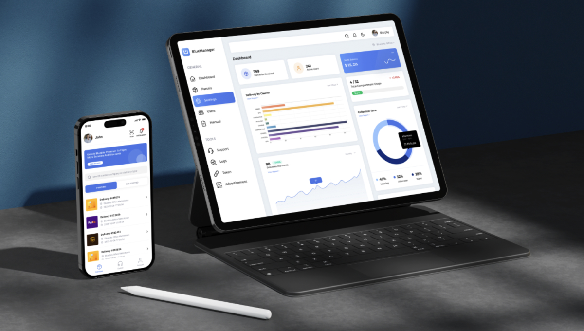
The objective was to develop a scalable design system with reusable components, styles, and standards that would enable our team to build higher-quality products more quickly.
At that time, the company’s design system was fragmented and inconsistent, with key components of a reliable system being overlooked. Oftentimes these unfortunately didn’t match the Figma designs (or in some cases the Figma designs were missing completely), so I had to work closely with the development team to conduct an audit of the project repositories to gather all the UI components in use. This UI inventory provided a clear overview of the current design variants and served as a reference guide for design patterns. While perfoming an audit of the existing components, I identified the following problems:

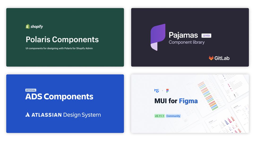
I also researched other design systems and interfaces, comparing our components to well-known systems to identify best practices and unify variations that would best serve our users' needs.
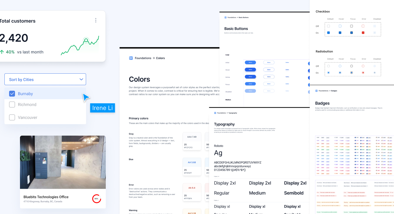
After finishing the audit, I laid out components and their variants from different platforms/pages side-by-side in Figma, in order to examine and consolidate them. I had to decide which redundant component variants to remove, and which ones to keep as the official variants.
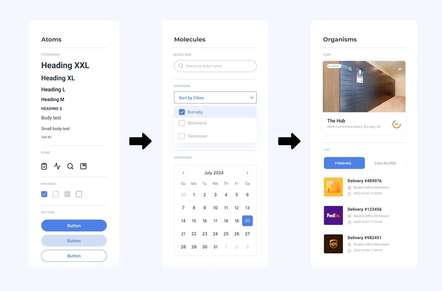
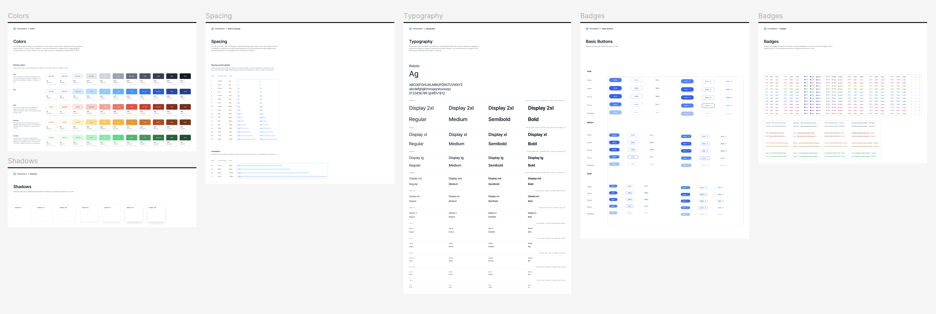
I applied Atomic Design approach by focusing first on the foundational elements (atoms) of our design system, such as color palettes, fonts, grid, spacing, buttons, etc., and then I integrated these elements to more complex blocks and pieces (molecules, organisms, templates, pages). This approach not only increased the flexibility of the design components but also significantly streamlined the overall front-end development process.
Here's a quick peask at how I organized my components using Atomic Design Principles:
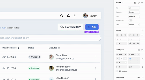
I utilized Figma’s auto-layout feature to make our components responsive across different devices and layouts.
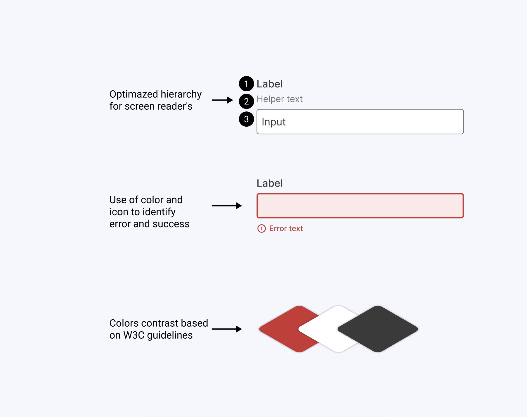
I designed each component with accessibility as a priority, aiming to fully comply with WCAG AA accessibility standards.
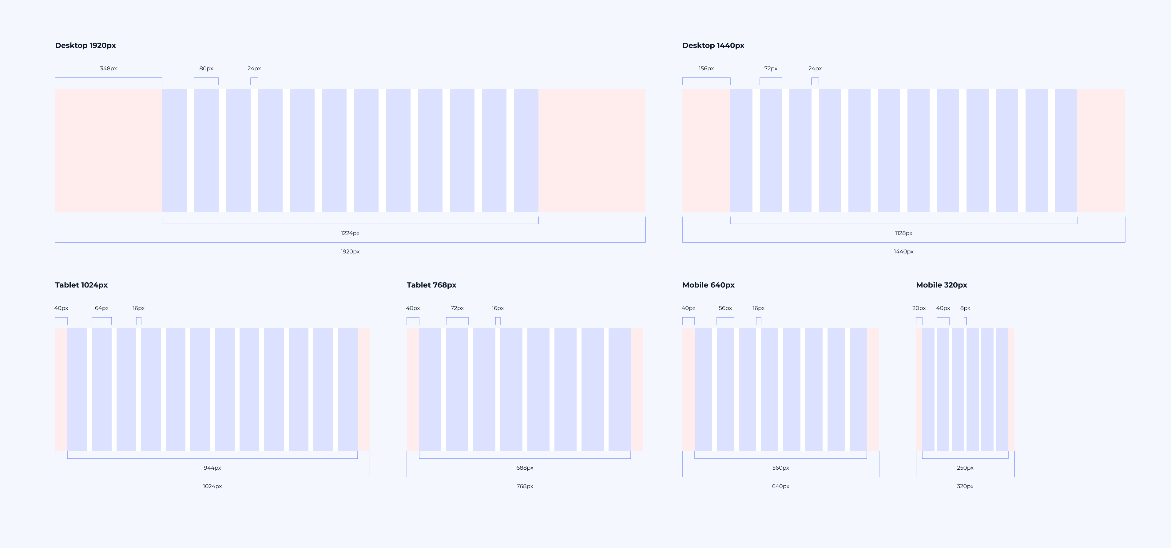
Working with the front-end engineers, we defined the grid for key breakpoints, based on their setup in bootstrap grid system.
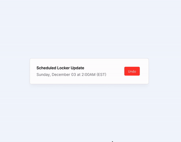
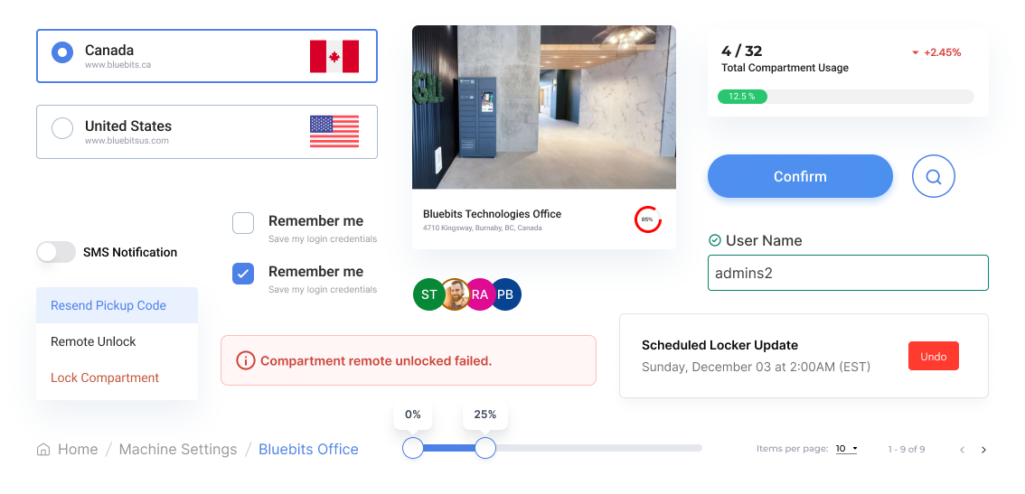
Another key consideration was designing with real data in mind. Using content placeholders in designs makes it much harder to see the issues and constraints that could arise when real content replaces it later. By using actual data instead of placeholders, I was able to avoid potential “what if” challenges later on, such as:
Reflecting on the original challenge—creating a design system that is simple, scalable, and usable by both designers and developers—I recognized the importance of addressing developers' needs.
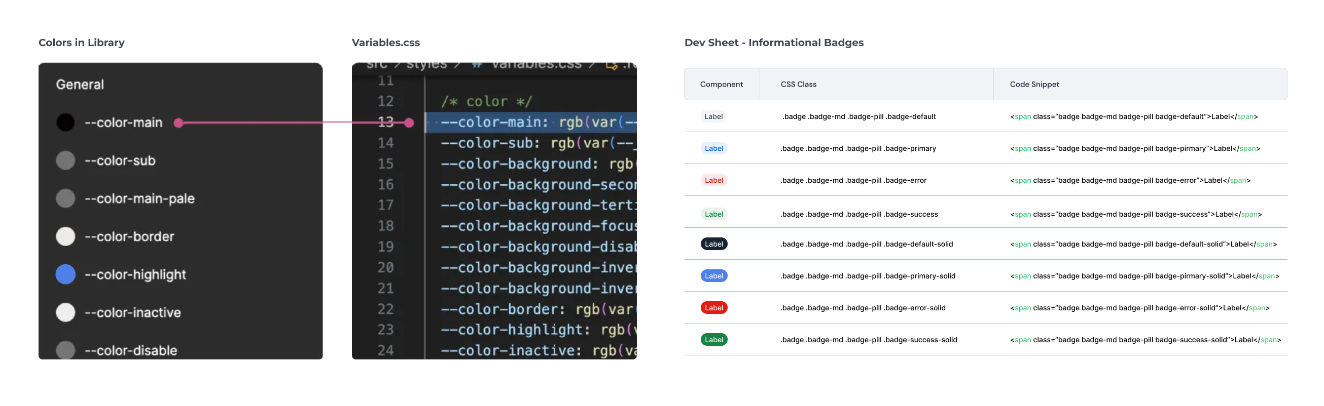
To achieve this, I partnered with the lead front-end developer to collaborate on the design system. Together, we developed design tokens, CSS classes, and code snippets, ensuring that naming conventions and component organization were aligned for both teams. This collaboration not only helped us understand each other's thought processes and communication styles but also played a crucial role in the success of our design system. It streamlined communication between developers and designers and facilitated seamless cross-app updates in the future.
I created a library of reusable components and define clear guidelines for their use. This library is built in Figma for easy access and updates. To maintain the system, I had regular reviews and updates based on new design requirements or user feedback. I also ensured that all team members are trained on how to use the system effectively, promoting consistency across the product.
This project not only gave me a big boost in working faster and more efficient on Figma, but it allowed me to think systematically and understand the importance of creating a shared design language for companies that need to be communicated effectively amongst stakeholders, developers, and future designers.

Scrolled this far, you must really like me. Contact me in case of any questions or opportunities.
Send me an Email Hello.IreneLiDesign@gmail.com © 2024 Made with ❤ by Irene Li