scroll
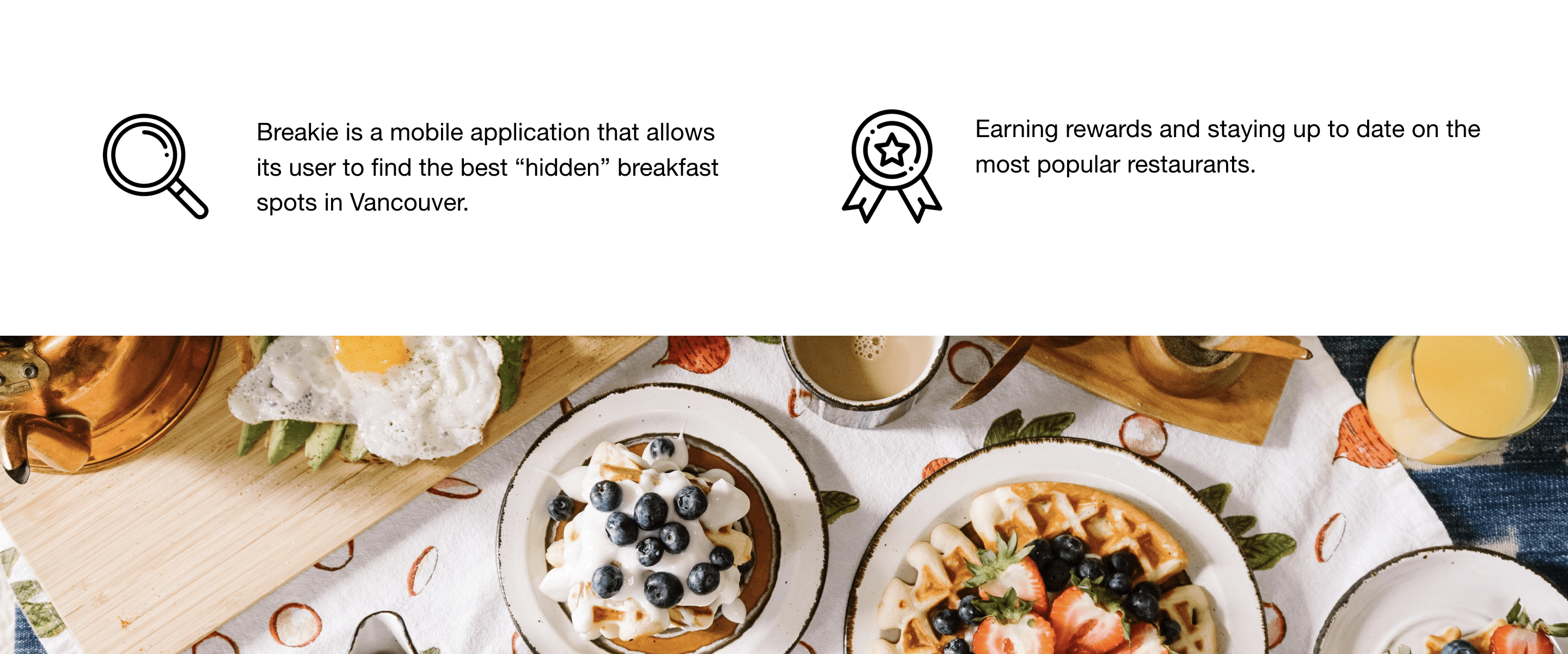
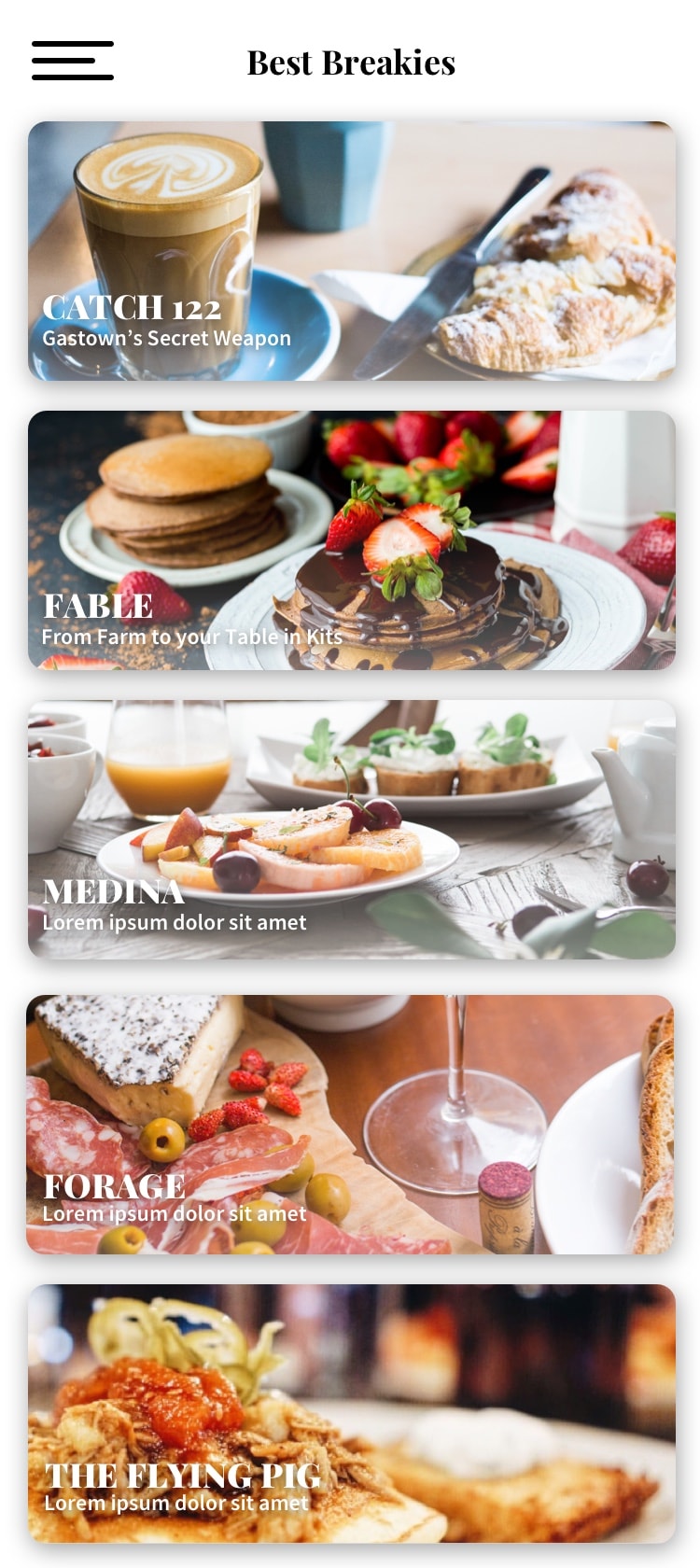
The aim of this project is to design engaging and impactful app screens for a conceptual app called Breakie. Vancouver is home to numerous excellent breakfast restaurants, many of which are hidden gems scattered across the city. This makes it challenging for people to discover the best spots. Breakie addresses this issue by offering a highly curated selection of the top breakfast restaurants in Vancouver.
As the designer, my primary goal was to effectively connect with both parents and children, the target audience of the company. I worked towards capturing the essence of the company's vision while meeting diverse needs. The school logo aimed to be colorful and inviting to appeal to younger audiences, while also representing CMG's position as pioneers in providing drama education for kids.
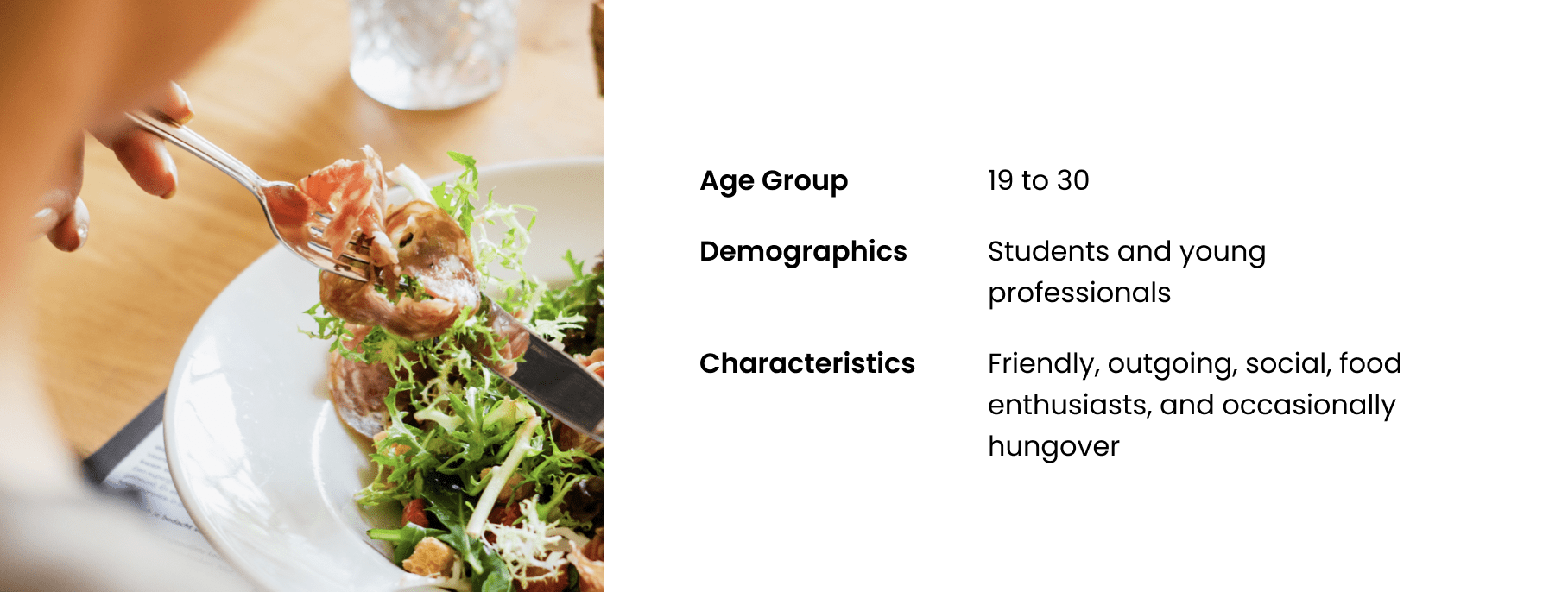
During the ideation process, understanding the primary audience was crucial. This insight helped shape the design direction to meet users' needs and provide the best app experience. Breakie aims to be simple, inviting, and modern, catering to young, tech-savvy, Instagram-loving foodies in Vancouver.
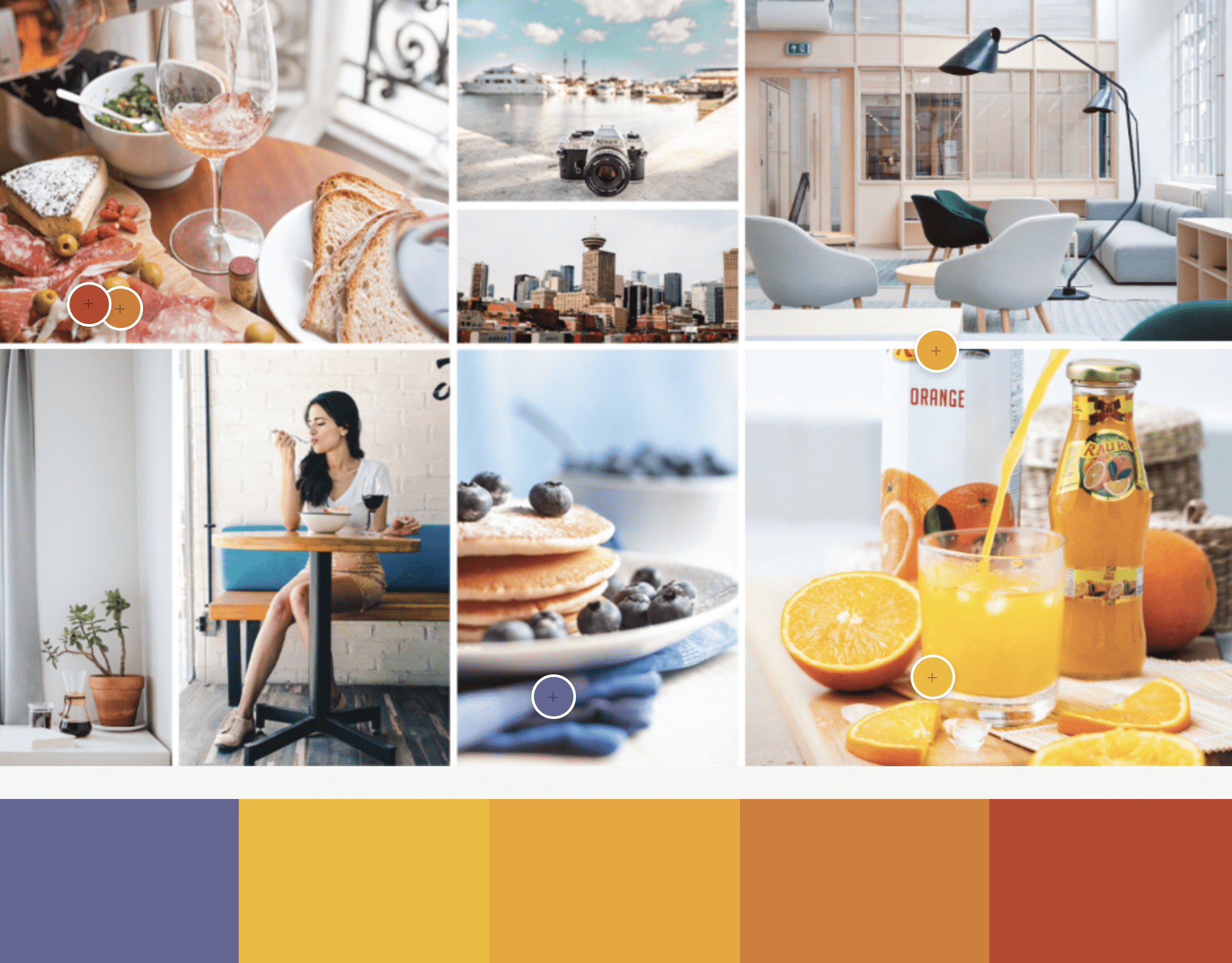
To begin, I created a moodboard to experiment with the color palette, imagery, and visual hierarchy. The goal was to set a cozy, simple, fresh, and relaxing mood. With this foundation, I moved on to collecting visual elements that reflect the desired ambiance and enhance the overall design.
The central principle of Breakie's visual design is maintaining a clean user interface with a strong emphasis on content. The combination of yellow and purple, along with black text and white space, ensures the app is both visually appealing and user-friendly.
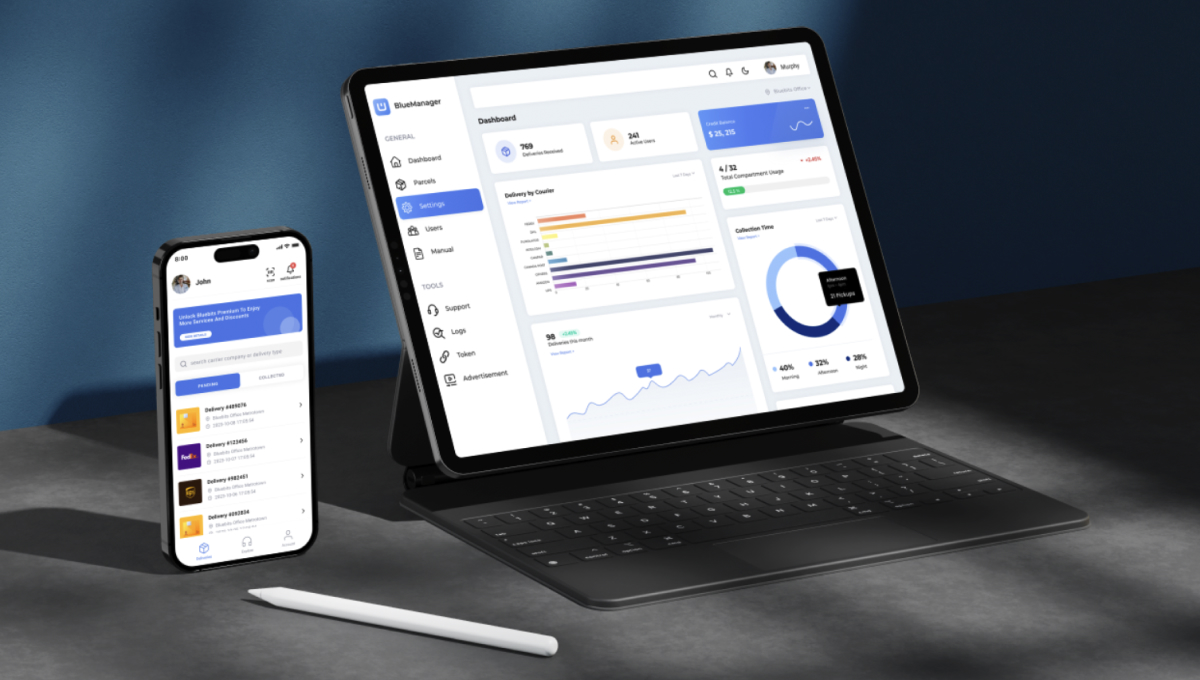
By integrating these features, Breakie aims to enhance the breakfast dining experience in Vancouver, helping users discover and enjoy the city's hidden culinary treasures.


Scrolled this far, you must really like me. Contact me in case of any questions or opportunities.
Send me an Email Hello.IreneLiDesign@gmail.com