scroll
BlueBox for Bikes is a bidding project with the City of Burnaby, it aims to revolutionize bike parking by offering a smart, secure solution tailored to community needs. The accompanying mobile app allows cyclists to easily locate smart bike lockers, reserve parking in advance, monitor and manage their parking.
As the lead of the product team, I oversaw the entire project lifecycle, from user research to interface development. Working against a tight six-month deadline, I collaborated closely with the development team to swiftly design, develop, test, and launch the app.
To clarify the project requirements and scope, we started the project by hosting a kickoff meeting with the city. Together we identified risks and aligned on expectations and constructed a shared vision for the app.
Identifying our common goals and objectives early in the process also provided a framework to reflect upon and guide decisions quickly throughout the fast-paced development cycle.
Tight timing meant that we needed to be efficient conducting user research and collecting feedback. Initially, the team planned to conduct quantitative research through online surveys due to concerns about finding participants for interviews during holiday season. However, I suggested that qualitative research would be more effective in this case. It would allow us to better investigate the underlying problems and uncover non-obvious insights that wouldn't surface in an online survey. Additionally, qualitative research would enable us to include diverse demographics, such as elderly people, ensuring a more comprehensive understanding of user needs. The team took my suggestion and we embarked on a three-week research sprint, conducted 6 in-depth interviews, and we also investigated public forums such as reddit and facebook group to discover what the end users truly wanted, needed and expected.
The interview questions were formulated around 3 key topics:
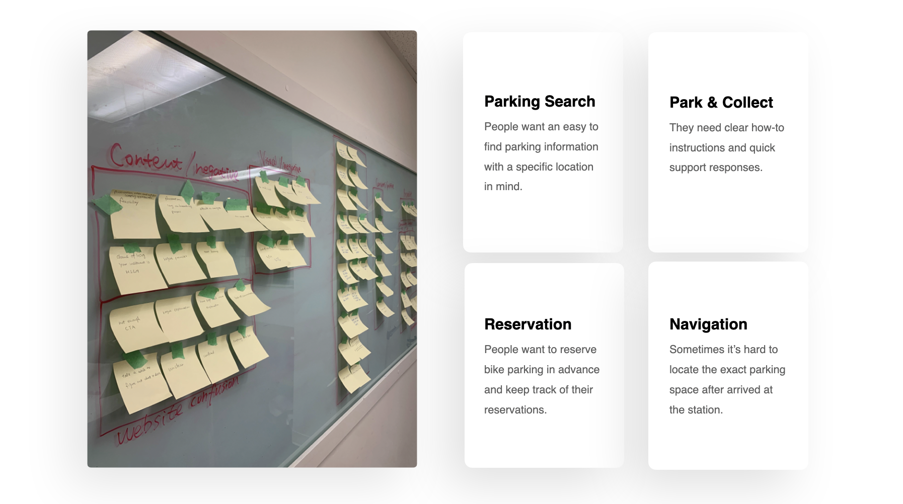
The results of the research and interviews were analyzed, clustered and affinity mapped. This process helped us identify and mapping user intentions. It helped us navigate from a larger and more ambiguous problem space, to a smaller subset of the puzzle.
People find it difficult to commute by bike because there is currently no way for them to plan ahead and avoid potential delays or complications related to bike parking. We discovered that, other than lock/unlock the smart biker lockers through the app, it is also necessary for the app to include features such as parking search and parking reservation.
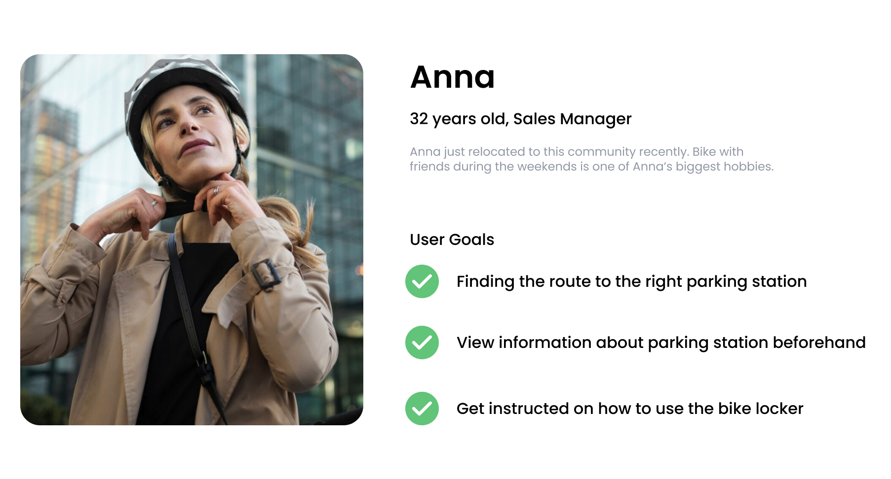
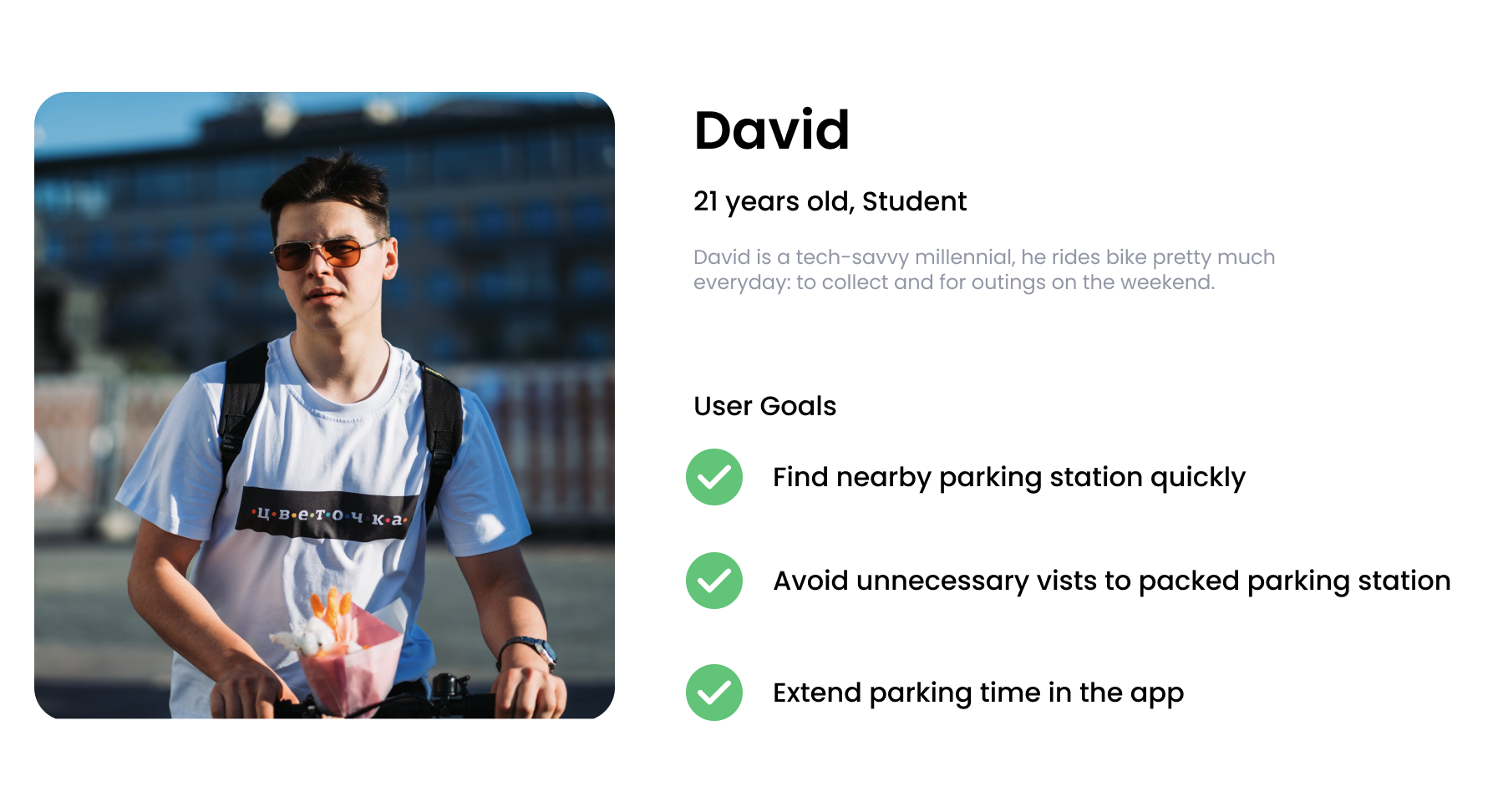
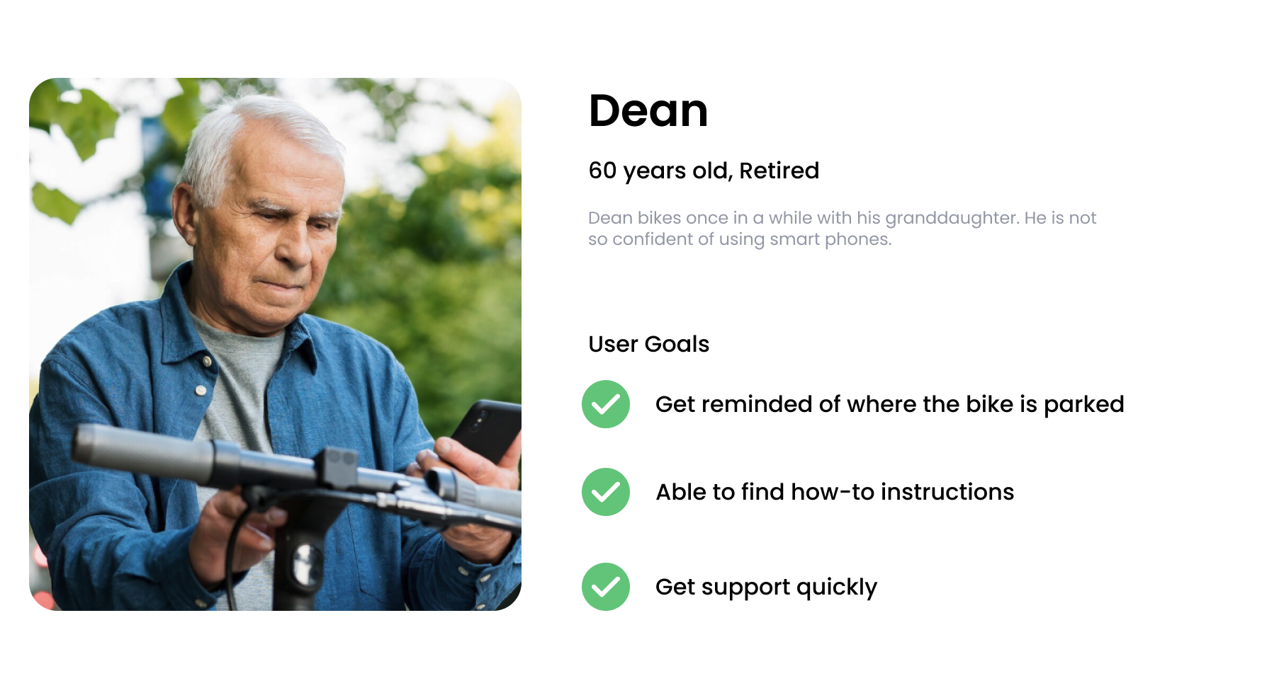
Drawing from the research compiled, I was able to identify three major categories of target users. The accumulation of the different insights and common patterns that came from the users’ answers helped me create three personas, each with unique characteristic and behavioral traits. This approach allowed us to design with specific user types in mind rather than for a generic user, enabling us to resonate more effectively with these three distinct user groups.
To construct the narrative of the users’ experience, I organized my observations into a customer journey map which provided a structured representation of how users experience various emotions and challenges throughout the bike parking experience.
We discussed the user journey map with the city to develop a clear picture of who the design of the app would target in phase 1 and later in future releases. Given the diverse levels of familiarity with smart technology and the varied cultural backgrounds of users, we realized that creating an easy-to-understand interface and achieving a smooth workflow were crucial for the project’s success.

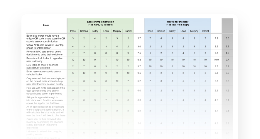
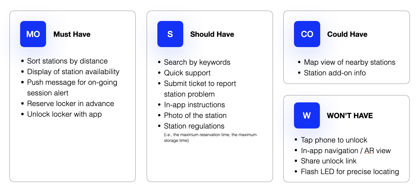
Excitement and momentum really started to build as the team became engaged in the process of crafting our solution together. Together with the dev team, we brainstormed 47 initial ideas that could be implemented to meet the user needs. Not all of them are feasible and we were not able to implement all of them precisely though the application.
I organized a google sheet and asked the team to give each idea two ratings according to the criteria - ease of implementation and usefulness for the user. And then to determine which features we needed to include and which ones were too complex to develop with the tight project timeline, I created a MoSCoW framework to prioritize Must have, Should have, Could have and Won't have criteria.
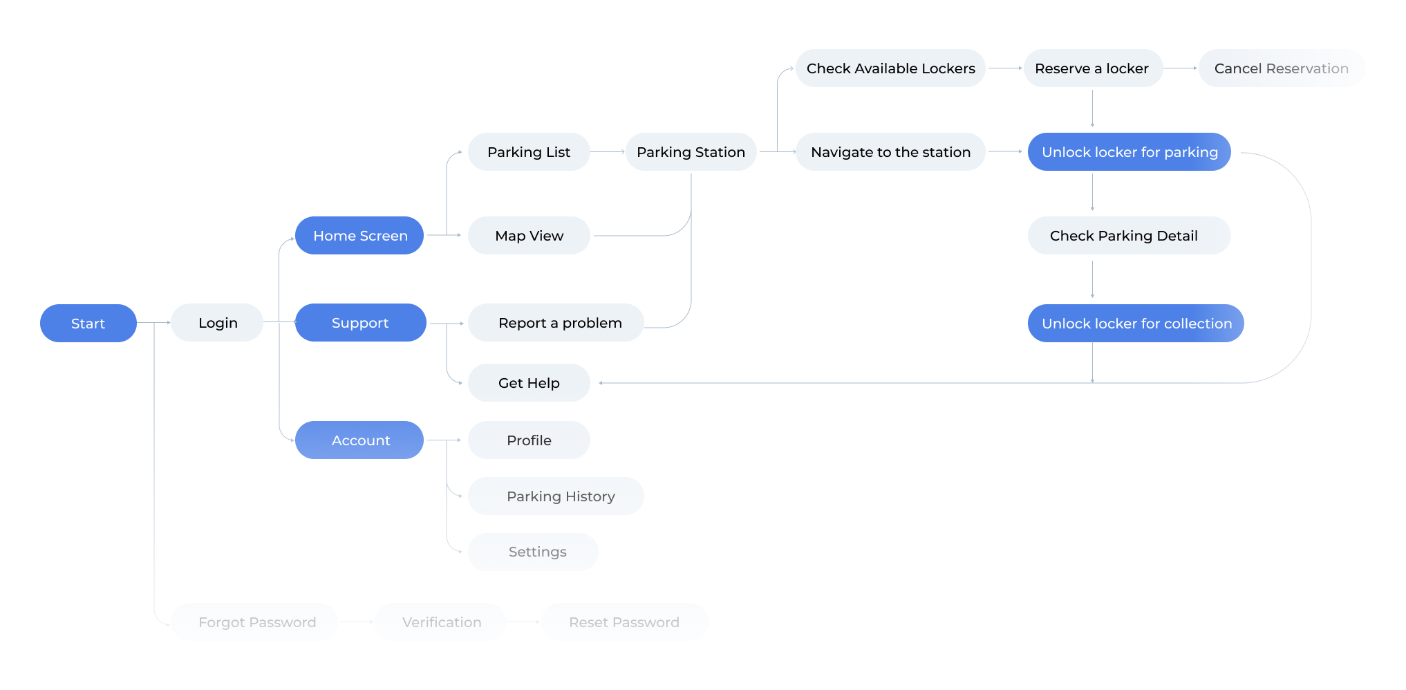
There are many different pathways a user couldtake when interacting with a product. To provide a clear visual representaton, we mapped out the series of steps a user will take to accomplish specific tasks or goals within the application, which would help us figure out the connections between screens and ensure a logical, intuitive progression through the app. We also invited some participants to join the team for card sorting to categorize all the features under different main screens. This approach helped us to identify and address potential usability issues early in the design process.
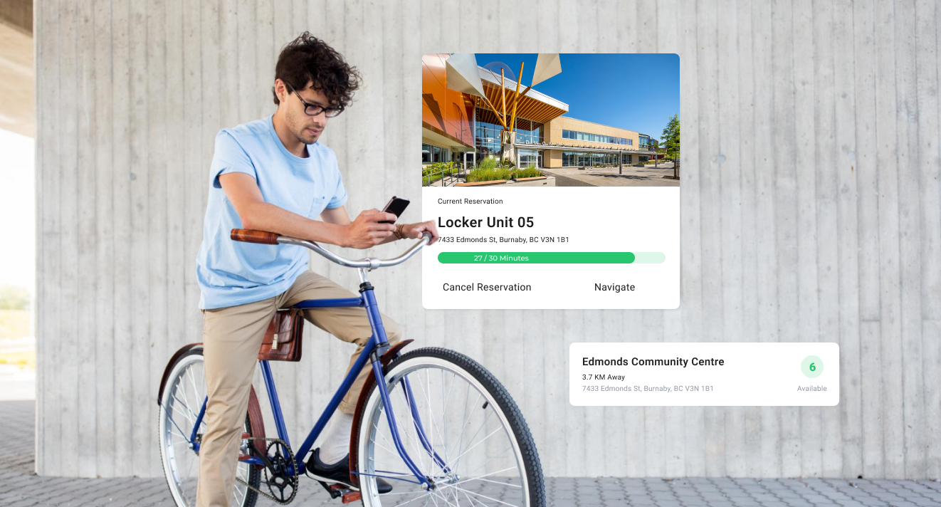
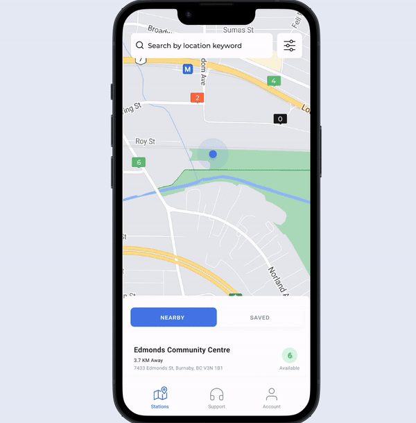
Displays nearby parking stations on a map view, with stations colour labeled based on their availability.
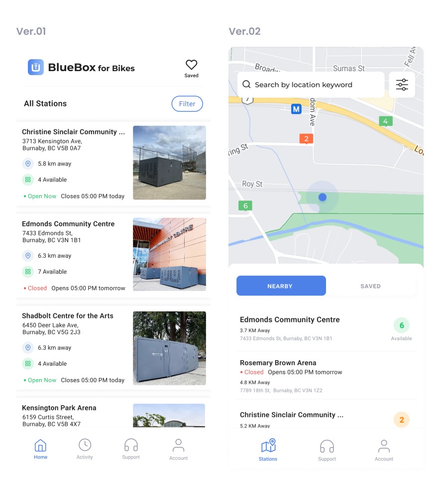
This page underwent two major changes: the bottom navigation and the overall layout.
First, we relocated the "Activity" tab from the navigation bar to the Account page after discovering through user testing that it was rarely accessed. We also renamed the "Home" tab to "Stations" to provide clearer guidance for users.
Given our tight timeline, we opted for a simple list view with station photos as visual cues, aiming to help users quickly make informed decisions when searching for a parking station. However, during testing, I observed that while the task completion rate was acceptable, users took significantly longer to complete the task and exhibited a lack of confidence.
Based on these findings, I recommended implementing a map view for this core feature and abandoning the plan for in-app navigation, as it was less impactful. After conducting a series of A/B tests with Figma prototypes, we chose to implement the map view. This approach presented information more straightforwardly, making it easier for users to navigate. People could leverage their prior experience with Google Maps and existing iOS design conventions, leading to a more intuitive and efficient user experience.
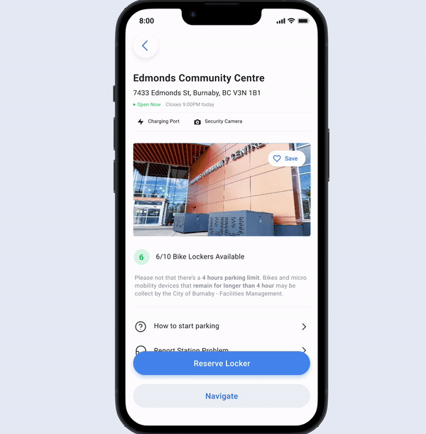
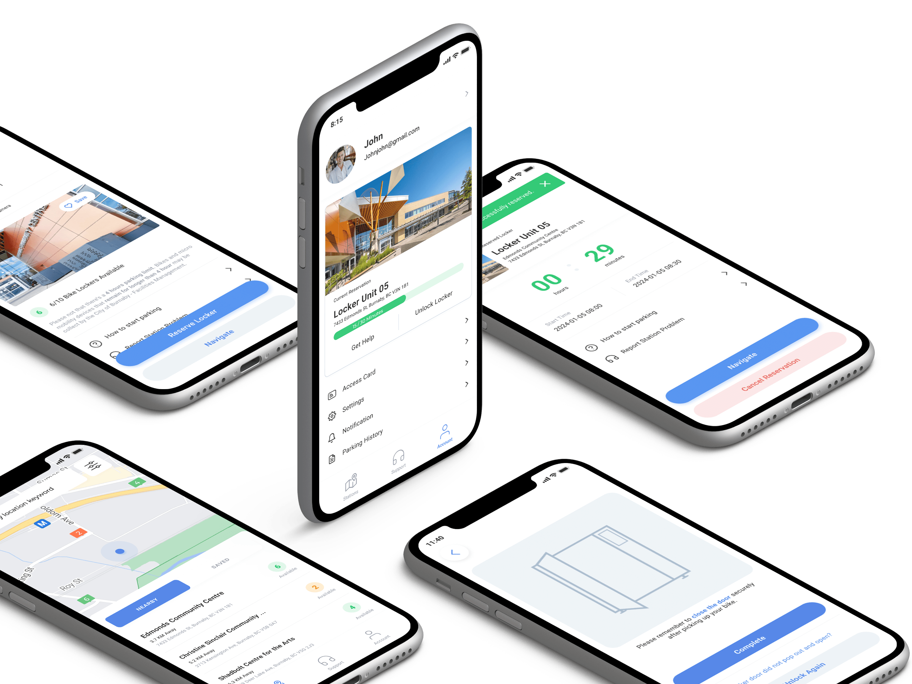
This is the station detail page, where users can either reserve a bike locker in advance or unlock an available locker on the spot without a prior reservation. To minimize visual clutter and guide users toward the appropriate action, instead of showing all options at once, we implemented a dynamic primary button that changes based on the user's proximity to the parking station. When the user is not near the station, the button displays "Reserve Locker." Once the user is within close range, the button dynamically updates to "Start Parking Session." This design ensures a streamlined and intuitive experience, allowing users to quickly and confidently take the correct action at the right moment.
When we were conducting the final usability-test round with the real build of the application, we encountered an unexpected issue with the locker unlocking feature. The functionality was not as stable as anticipated, occasionally requiring two attempts to unlock a locker. With the project deadline fast approaching, I proactively proposed a solution to mitigate the impact of this technical glitch. I suggested implementing a transition screen that would appear if the locker failed to unlock on the first try. This screen provided users with the option to retry unlocking or quickly access support, ensuring a smoother user experience despite the underlying issue. My intent was to maintain user trust and minimize frustration, even in the face of unforeseen challenges.


Scrolled this far, you must really like me. Contact me in case of any questions or opportunities.
Send me an Email Hello.IreneLiDesign@gmail.com